Brand Identity consultations I.
Shaping the brand experience via providing functional, pleasing, eye-catching, platform specific and unique solutions. Balancing fine arts with interior design, utility, and strong visual language elevating design-consciousness. Being well versed in building brands, craving progressive solutions, and giving them an edge, a perspective that is unique to the clients keeping their vision in mind. This results in surprising ideas, an unusual voice, and visual concepts in artistic direction, in brand management and brand development alike.
S/ALON BUDAPEST ‘19 graphic design
The mission of the annual Interior Design Fair is to create a platform that can proudly represent businesses that encapsulate the excellence of the home design scene.
SOLUTION
The diversity of interiors appearing at S/ALON are reflected in the event’s advertising platforms, where each piece stands alone, representing a singular style, interior, and character, and underlining the sophisticated aesthetic experience.
VITRIN events
VITRIN offers pieces that are suitable to furnish a variety of spaces. As Budapest’s premier chair showroom, it is also an event hub and creative base, hosting presentations, workshops, and exhibitions in an effort to popularize conscious design and track fresh trends.
SOLUTION
The showroom not only hosts exhibitions, but partakes in shaping the concept, working together with designers. Their mission is to elevate design-consciousness, providing access to their knowledge base, supplementing commercial activities, and keeping the professional community up to date on current trends and tendencies, strengthening the brand’s credibility.
STUDIO E Brand identity & web design
Studio E. is a clothing consulting brand and educational program of fashion consultant, stylist, and costume designer Eszter Füzes, who is also the founder of the former USE unused brand and has a 15-year history in the fashion industry. The brand aims to help its customers to find a path to inner harmony by putting conscious choices first so that they can become confident and engaging.
SOLUTION
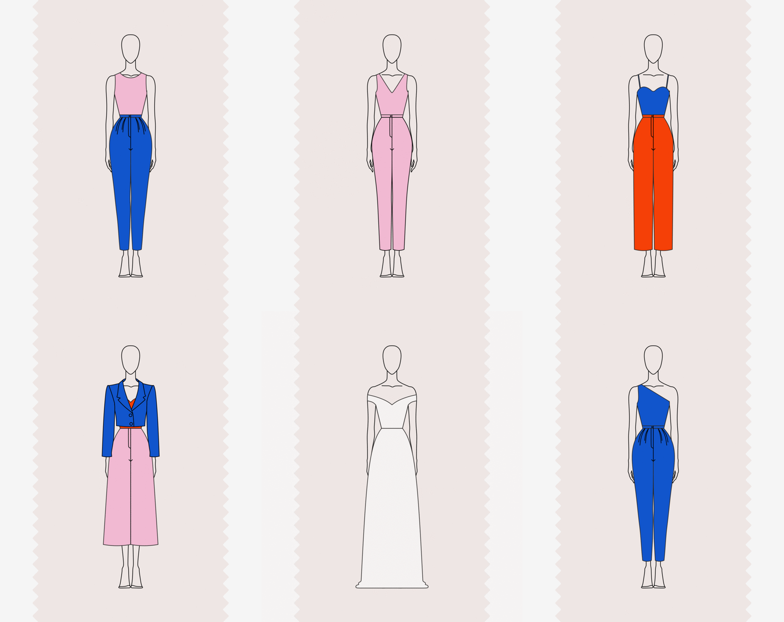
We have designed a sophisticated, mature, and confident image concept, the beauty and value of which lies in pure functionality. Colors, icons, and patches can be combined well and work as a well-navigating (e.g., on the website) image system. They contain endless possibilities for use, both individually and in combination. By highlighting the letter 'E' of the logo it becomes a symbol. Its floating and elevated position also refers to education, as the goal of Eszter’s educational program is to shift the participant by making them become confident and raising their consciousness during the process.
In addition to prioritizing information, the layout of texts on the website also works as a graphic element. The use of oversized text highlights, a wide color palette, and associative images seeks to achieve a strong aesthetic effect. The schematic illustrations used in the educational material support its lucidity, and its icon system works with simple geometric, abstract shapes. For a restrained, harmonious overall effect, we used images that contain only a few colors, striving for a natural look with a palette of soft, pastel shades.
Codesign & graphic design: Eszter Kavalecz


