Design Fair design strategy
The mission of the annual S/ALON BUDAPEST Interior Design Fair, launched in 2018, is to create a platform that can proudly represent businesses that encapsulate the excellence of the home design scene.
The compilation of the concept of the unrealized exhibition in 2020 was built on a cohesive element that had to meet many different aspects. The development of the system affects every detail of the exhibition and serves as a response to different situations during the preparation phase.
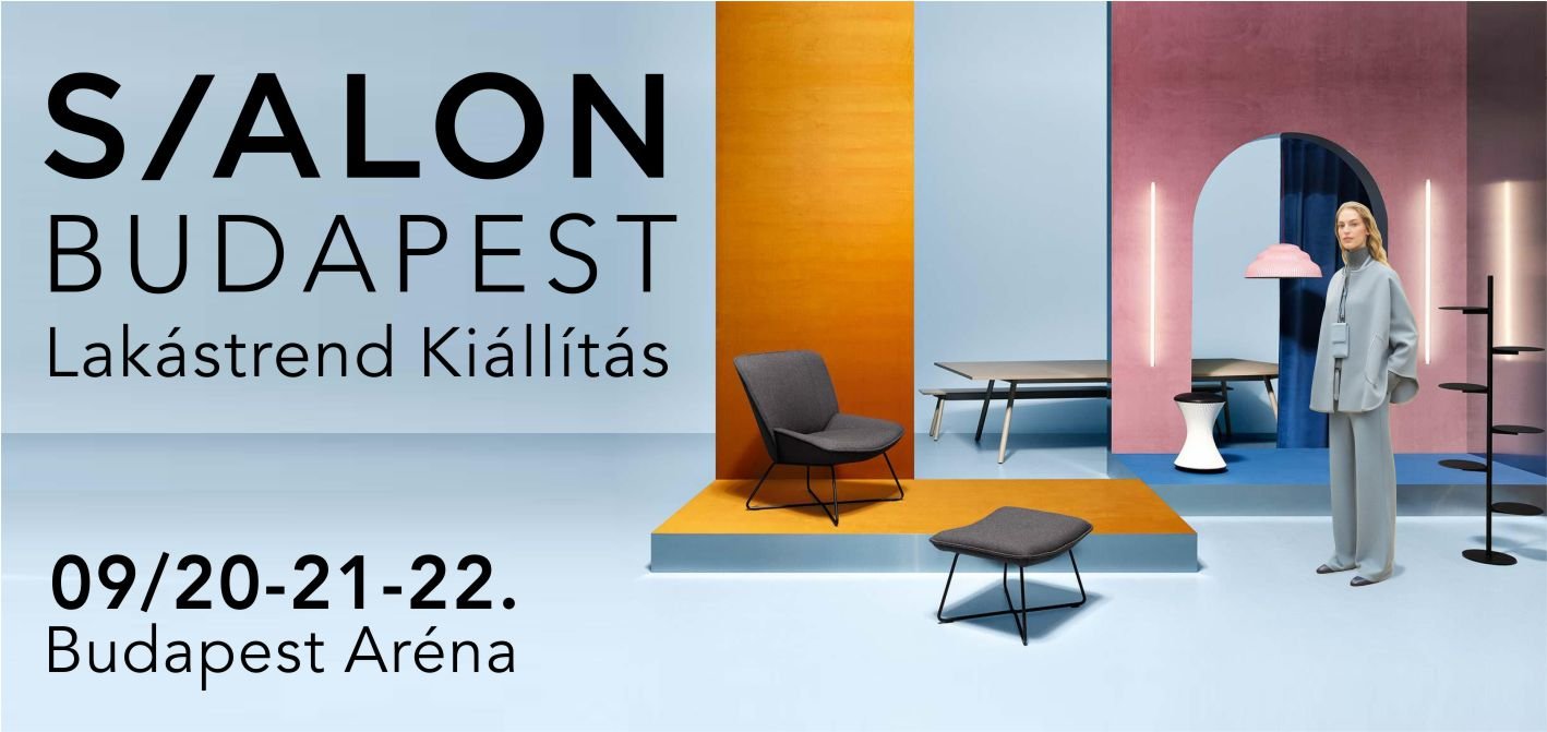
In the S/20 design strategy document, we used the arch shape as a connecting element, which we extended to all possible manifestations of the brand, to its own mediums, thus making it more identifiable and even more lovable. By connecting it to the overall brand image we strengthened its emotional influence while broadening the perspective of other applications. We also derived the concept of the exhibition campaign from this element. It provides the basis for all types of visual communication and the design strategy itself predicts how we can utilize this detail on our own advertising surfaces and platforms.
The arch is a characteristic constructional element, a defining feature in modern architecture and as well as a popular trend nowadays, which appears in a wide variety of situations. An arch in itself is a spectacular element, but with a variety of solutions it represents the concept of exteriors and interiors- it can define the space, it may appear as decoration or in the design of an additional object such as furniture or other home accessories, whether interpreted as optical illusion or focus point. It serves as a gateway or marks the entrance to another world, with a spectacular concept beyond functionality. By changing the radius of the arch, we can transform the element into a different aesthetic experience. The rounded design brings softness, lightness and sophistication. Its multiple repetition is spectacular and impressive on an architectural scale. The arch frames the plain wall surface into a spatial situation- it divides the space, splits it into two, makes it open, and creates the interior even without furniture. The play of its shadows can create an exciting visual feature.
The design strategy presents different options to design the exhibition’s own booths or the stands of the partners, strengthening the representation of different products, i.e. the physical presence of the campaign was also derived from it. The comprehensive application of the design strategy also supports the curation of the exhibition's booth designs- which was an important aspect for us as the art directors of the design fair- creating the opportunity to effectuate a more unified exhibition image. While strengthening the brand itself it proposes professional high-standard booth designs throughout the designing phase year after year. Complemented by innovative manifestations and original details, we further strengthened the influencer role and the overall image of the design fair.
Codesign & graphic design: Eszter Kavalecz


